10 Ways to Double Your Website Revenue
In recent years, marketing strategies have shifted focus from traditional outbound marketing, where companies pursue customers, toward inbound marketing, where the customer finds the company offering the product they need. Years ago, marketers would largely have to go out and get prospects’ attention by running commercials on television and radio or posting print ads in local media.
With the improved performance of search engines and accessibility of mobile devices, buyers now have the ability to find exactly what they want, with the specifications they need and do so very quickly.
In fact 67% of consumers have made the decision to buy before even contacting your company. They are adept at using online resources to educate themselves on everything from your reputation as a provider to the quality of your products. This self-education process may have been the reason a consumer has arrived at your site in the first place, not necessarily to purchase your product but to make an informed purchasing decision. The most fantastic product in the world is not going to hit that cart until this quest for information has been satisfied and if you don’t provide it the next site likely will.
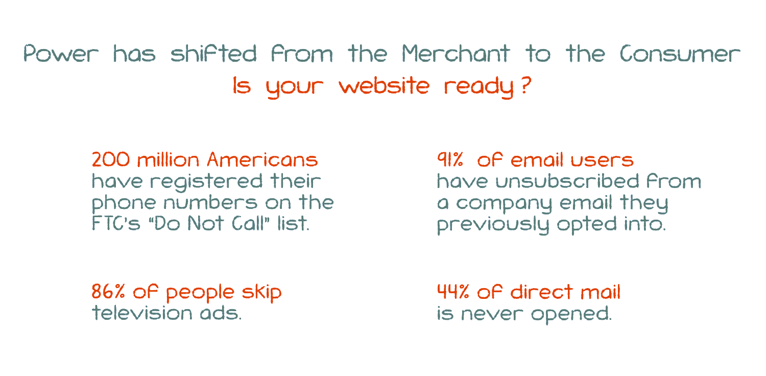
Like it or not, in our new digital age, your website is no longer just the face of your company, it is a living, breathing sales force and you could be losing up to half of your sales unless it’s designed around this premise. The Internet has shifted power away from the seller and toward the consumer, and this new buying power mandates attention to the consumer like never before. Not only is it important to provide information your audience will find valuable, but present it in a fashion that is intuitive, efficient and packaged in a way that funnels the customer directly through the purchase process. Enter Conversion Rate Optimization.

Conversion Rate Optimization or CRO is the packaging of information and resources on your site in a manner that makes the visitor more likely to perform particular actions, like filling out an inquiry form or purchasing a particular product – effectively converting that visit into revenue for yourself and a pleasant experience for the consumer.
Too many companies these days have jumped on the Online Marketing bandwagon and are pouring hundreds or thousands of dollars per month into Social Media and/or SEO packages. While this can be a worthy investment, most of the sites are so ill-equipped to manage visitor flow that the average conversion rate (the amount of visitors that make a purchase vs. leave) is generally around 3 percent. That means that for every 100 visitors that land on your site, 97 of them will leave, either because they have not found what they are looking for, have not found it fast enough, have found the purchase process confusing or have just found your site all-together revolting (just kidding, but you see my point).
In my 20+ years as a designer, I have seen many instances where site owners have thought that the only way to double their revenue was to double their advertising budget. By adopting this strategy you are literally just paying for twice as many dis-satisfied visitors. Rather than losing 97 out of 100 visitors as we discussed previously you’d be paying to lose 194 – and doing it every month … forever.
This process of pouring marketing resources into an ill-equipped site can be likened to pushing around a car with flat tires. Why not invest in new tires and have the car take you where you need to be, rather than the other way around?
Re-designing your website using the proper conversion optimization techniques can give you that boost from 3% to 6%, effectively doubling your site revenue with a one-time investment, saving tremendously over time. This is especially true for service-oriented companies, where success may be measured not by sales volume, but by establishing long term relationships with clients. Exceeding visitor expectations can not only bring them back but get them talking about you – isn’t that what it’s all about in the first place?
If a new website design isn’t in the cards right now, there are still a few measures you can take to get that conversion rate headed in the right direction:
1) Eliminate unnecessary links and clutter from landing and product pages.
The average web denizen has the attention span of a Frisbee. They know what they want and they will give you no more than 5 seconds to give it to them. Make the objective clear and eliminate as many steps as possible – from sign up or purchase processes.
2) Place the most important information ‘above the fold’ of your website.
This is the area of the page the visitor sees before having to scroll down. Make sure your visitor’s eyes are directed exactly where you need them to be, and if they are following a link from your main page it shouldn’t take them more than a few clicks to finalize the process.
3) Your online authority is important.
Have you received awards or accolades? Display these prominently on your site as well as any industry specific memberships or memberships in organizations like the BBB.
4) The two questions a new visitor will ask themselves immediately are “Am I in the right place?” and “How long will this take”.
Only use images and descriptions that best represent your products and services; eliminate bloat and don’t be afraid of white space. If a first-time visitor just wants a widget and 50 other sites sell widgets, they don’t care that you were established in 1929, they don’t want to hear a message from your CEO and they certainly don’t want to wait for a button to quit spinning so they can click on it.
5) Along the same lines, it also couldn’t hurt to replace all instances of ‘I’ or ‘we’ in your content with ‘you’ or ‘your’.
Today’s consumer wants to know what you can do for them and if there is going to be any of this extra talking or reading foolishness, it had better be about them and not you.
6) Understand your visitors pain points.
They have arrived at your site because they are hoping you have a solution to a problem. Don’t just mimic what your competition does, find out exactly what your customers need and the best way to get it to them. Remember, people don’t buy a drill because they need a drill, they buy one because they need a hole in something. Communicate and adapt.
7) Display your phone number prominently and consider a small contact form in your sidebar.
It saves a click to the Contact page and reassures your visitors that you are open and available.
8) Do not require shoppers to register in order to complete the checkout process.
The benefits of their easy return will be far outweighed by the number of shoppers who bail on the process.
9) Don’t forget to sell.
Remind your prospects just how painful it will be to continue without your product, why they should buy from you and not your competitor, and even include some testimonials scattered throughout your selling points. It is important to get the sale, but more important that the customer feels they are making the right decision.
10) Finally, the most important technique you can use to optimize your website conversion rate is to make sure that your site is mobile friendly.
Up until recently ‘mobile friendly’ meant that your site was accessible and navigable on mobile devices, but today it means much more. In a major algorithm change a couple of years ago, Google has begun not only measuring mobile compliance by its own standards, but favoring sites it deems compliant over sites it doesn’t. That means that if your website doesn’t pass the Google test, it will be pushed to the bottom of the list for mobile search results – this is a very big deal given over 50% of searches are now performed on mobile devices. You can type in your web address right here and have Google run the test on your site: Google Mobile-Friendly Test
Fusion Web Design of Metairie not only exceeds Google’s mobile compliance standards, but we develop using the latest content management systems like WordPress, meaning that you will have easy access to your site content and years of scalability. Call or email today for a free consultation.
